Interaction Design · Creative Direction · Learning Experience · STEM
Tinybop—
Light & Color
I led the visual and interaction design for a collection of experiences exploring light, color, vision, refraction, and perception.
The challenge was turning abstract science into something kids could manipulate, experiment with, and understand for themselves.
CHALLENGE
Making abstract science tangible
How do you make invisible phenomena understandable without losing what makes them interesting?
Digital interaction gave us room to reveal things that are difficult to see in the physical world. The trick was knowing when to stay close to the science and when a little exaggeration could make an idea click.
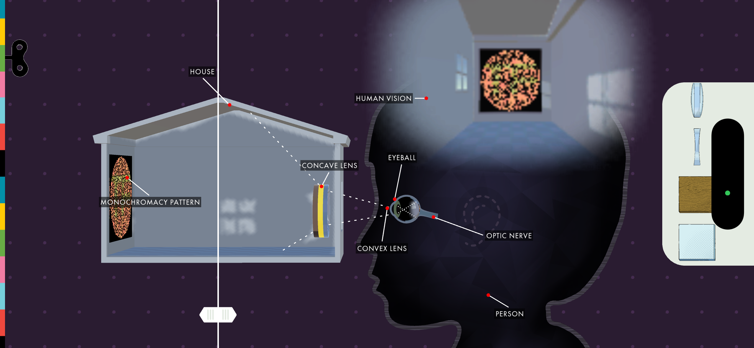
01 / INTERACTION DESIGN
Balancing accuracy and play
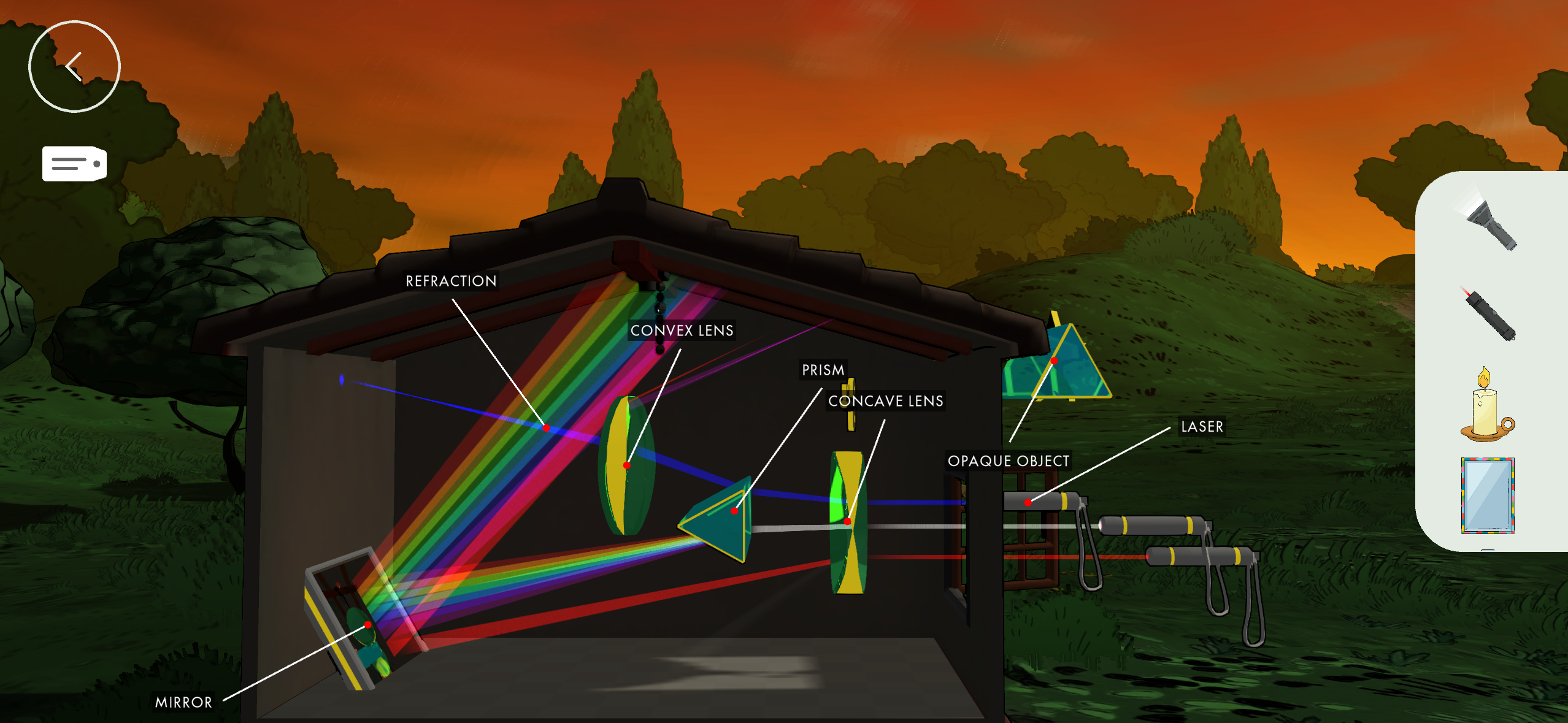
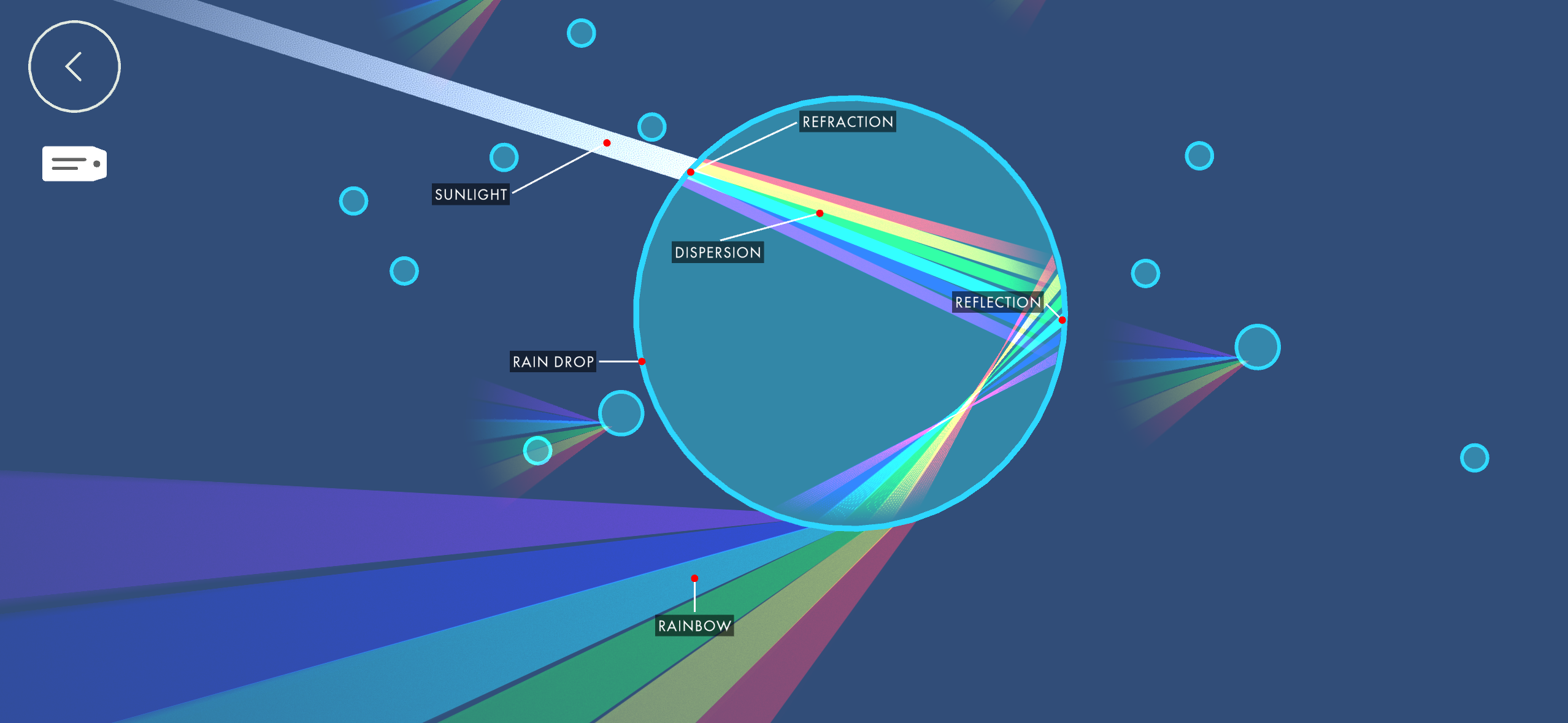
Some interactions stayed close to the physics, like rotating prisms, layering lenses, and tracing how light travels through the eye.
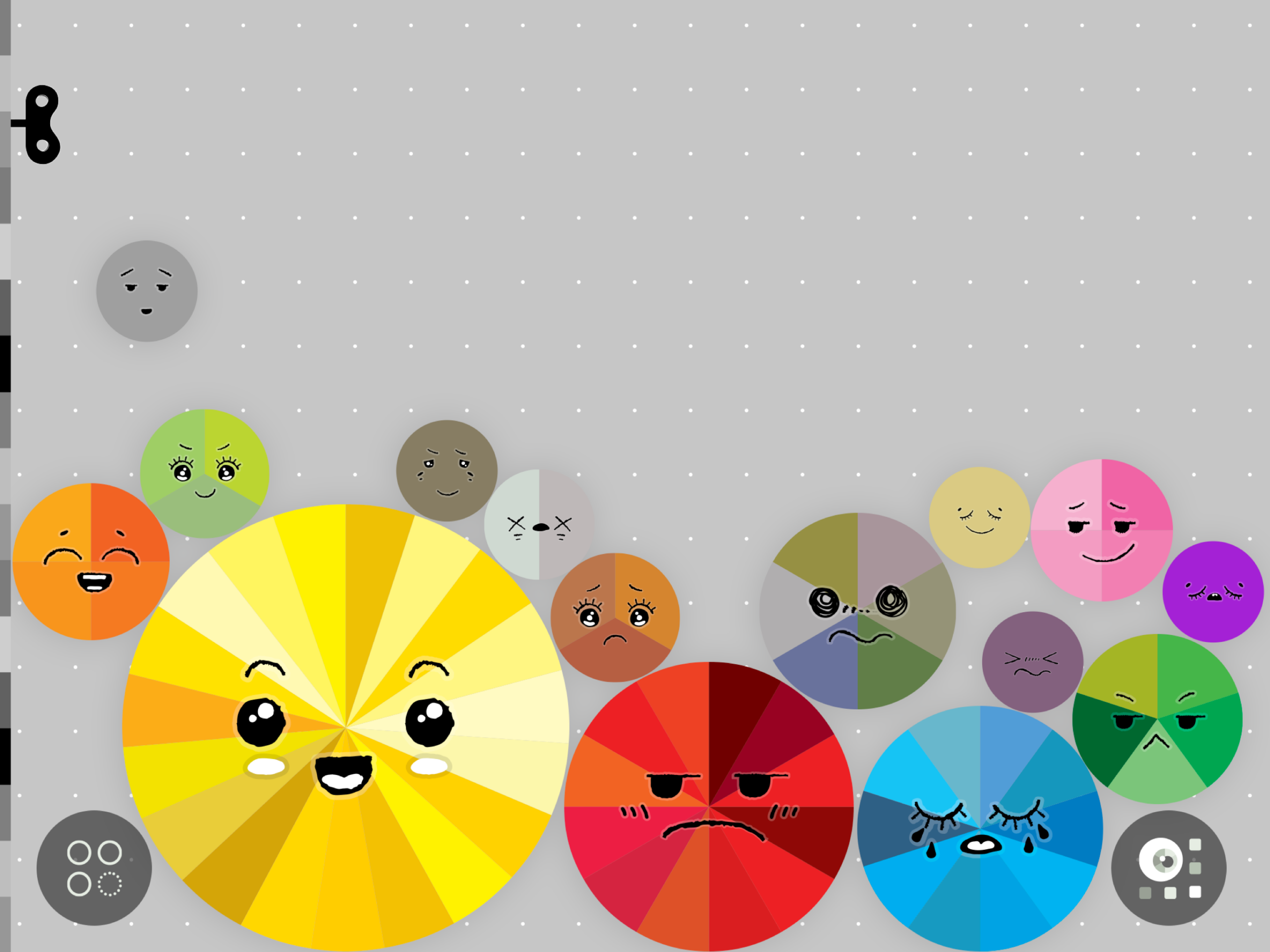
Others were more expressive: colors could merge, react, and burst when pushed too far. We wanted kids to experiment freely while still understanding the relationships behind what they saw.
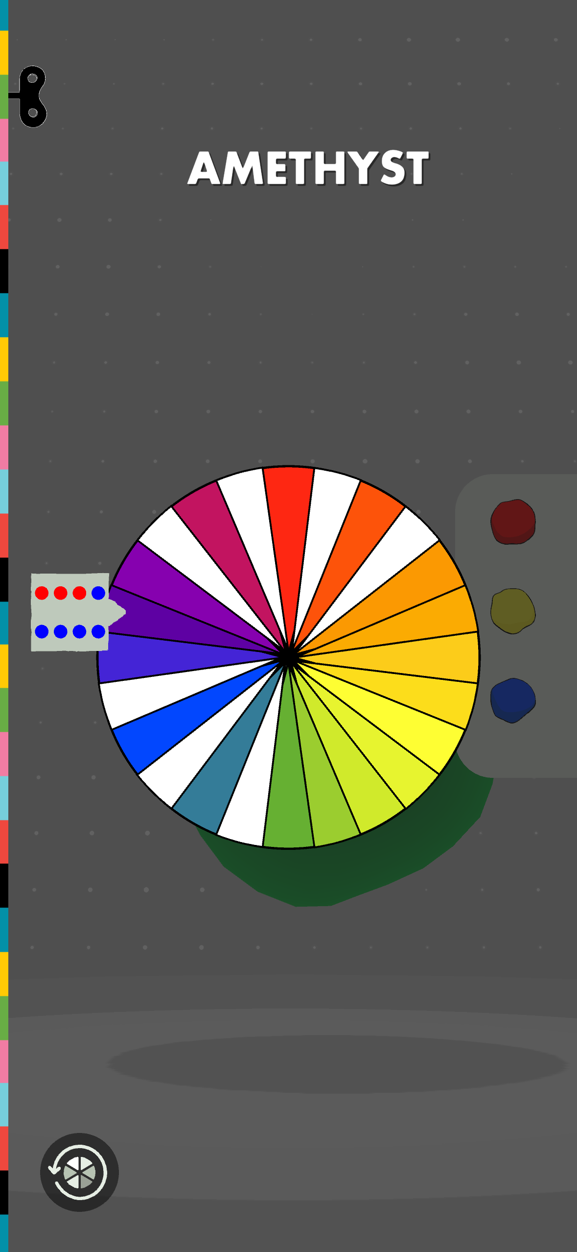
PIGMENT — drag colors together, discover mixtures, expand the color wheel
02 / COLOR INTERACTION
Making color feel tangible
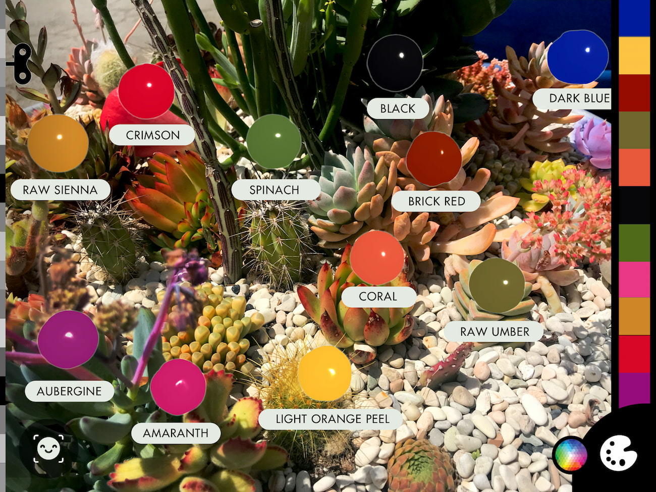
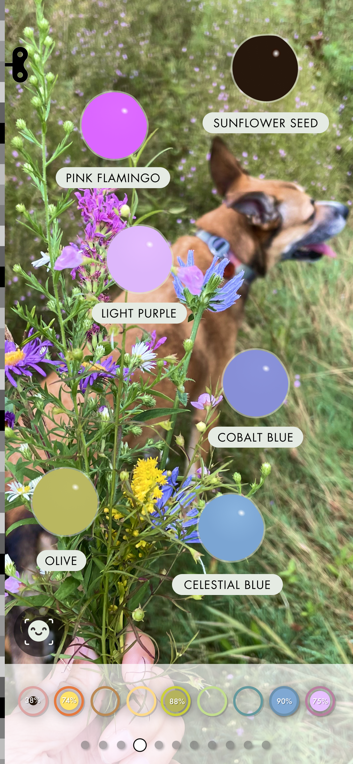
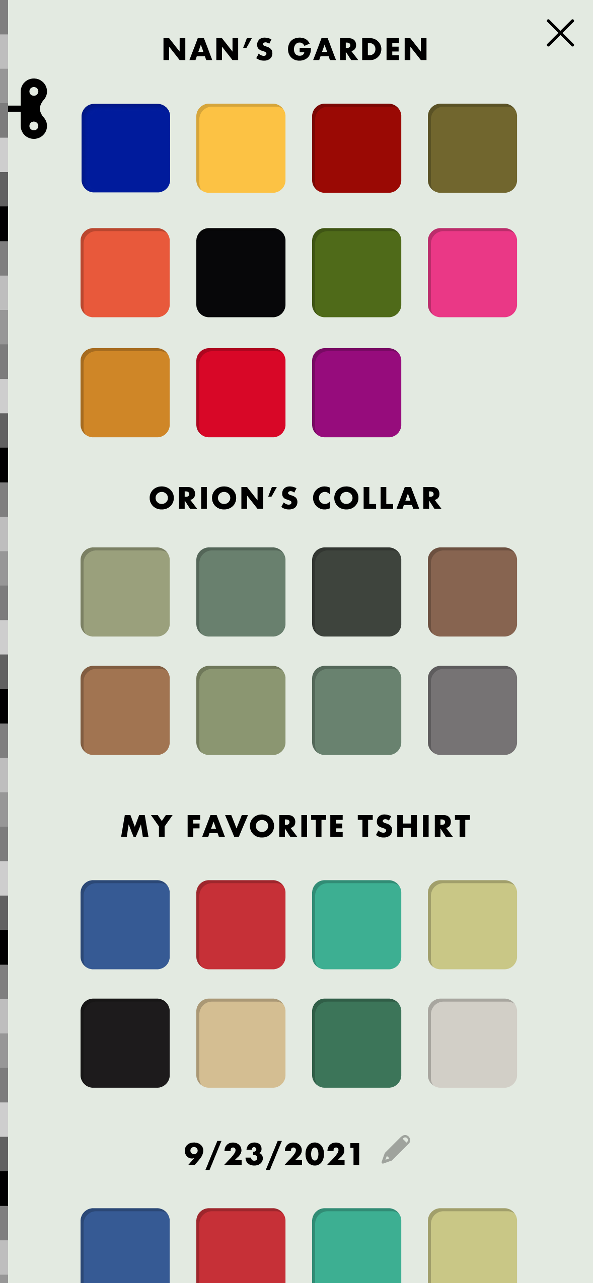
Instead of simply sampling a value, kids could pull color from the world around them with a little movement and elasticity, more like a droplet than a data point.
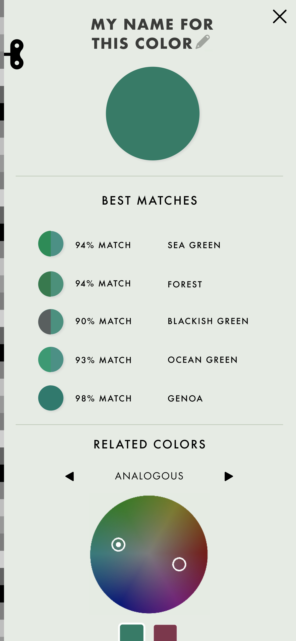
They could collect, name, and assign colors, then explore related palettes and color relationships without the experience feeling overly technical.
03 / FEEDBACK
Guiding without scoring
Some activities involved matching, comparison, and accuracy, but we didn't want them to feel like tests.
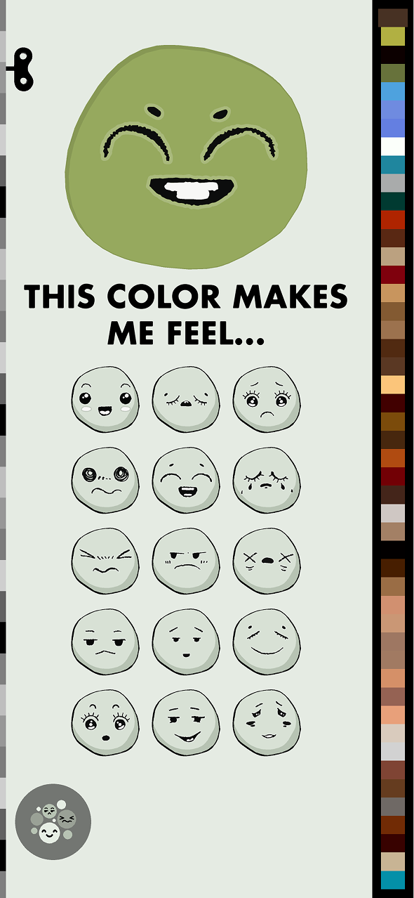
Feedback needed to be useful without becoming overly corrective. That thinking also carried into activities where kids connected colors to their own feelings, without being told there was a right answer.
04 / CREATIVE DIRECTION
One app, many ways to explore
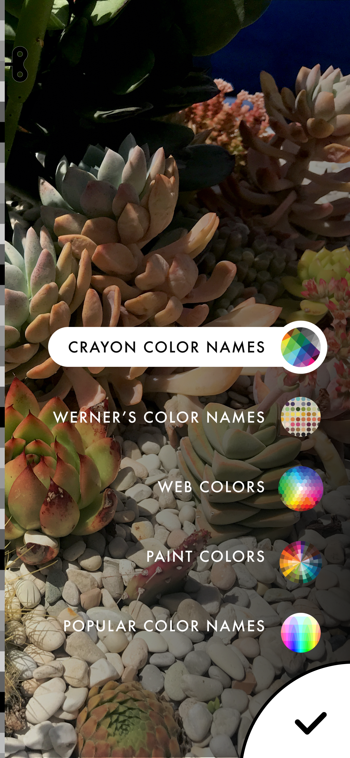
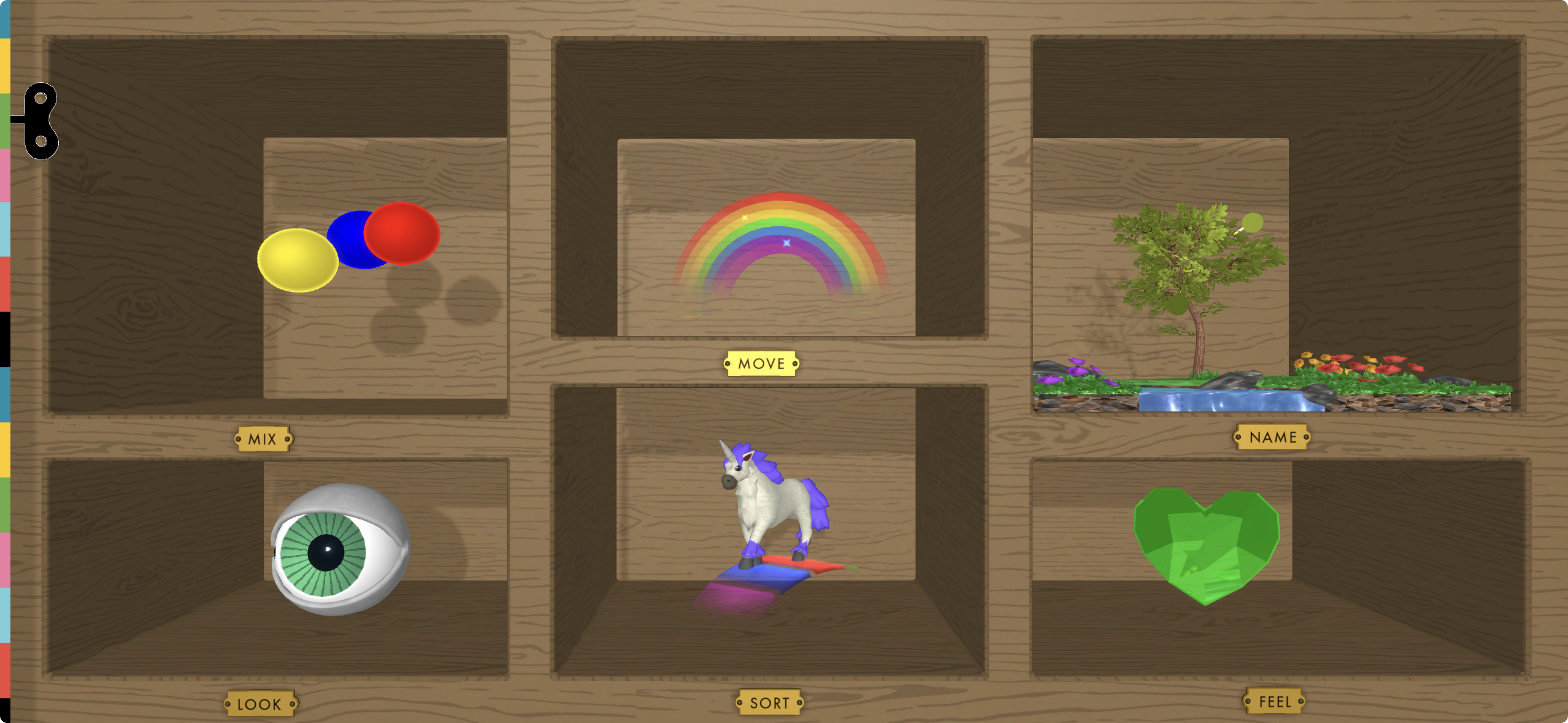
The app brought together very different experiences, from prisms and lenses to color mixing, perception, and collecting colors from the outside world.
I designed the visual language, interface elements, states, and scene compositions so each interaction could have its own character while still feeling part of the same product.
outcome
A playful system for exploring light and color
Light & Color brought together a wide range of scientific concepts in one interactive experience, giving kids different ways to experiment with light, color, and perception.
timeline
2021
platforms
iOS
Role
Lead Designer
focus
Product Design
UX/UI
Illustration
Creative Direction
recognition
2022
Digital Ehon Award – Yoichi Sakakihara Prize
2023
American Library Association – Notable Children's Digital Media
Collaborators
Robert Blackwood, Engineering Samuel Seidenberg, Engineering
Raul Gutierrez, Product
Kendall Noble, Animation
Eden Wall, Education
Rose Paisner, Education
Beckie Choe, Motion graphics